




Hi there! How can we help you today?
The Importance of Responsive Web Design in 2025
-
Home
-
Web Development
-
The Importance of Responsive Web Design in 2025

The Importance of Responsive Web Design in 2025
Responsive web design ensures websites deliver seamless performance and visuals across every device. In 2025, it’s not just about adapting layouts—it’s about optimizing user experience, accessibility, and conversions in an increasingly mobile-driven world.
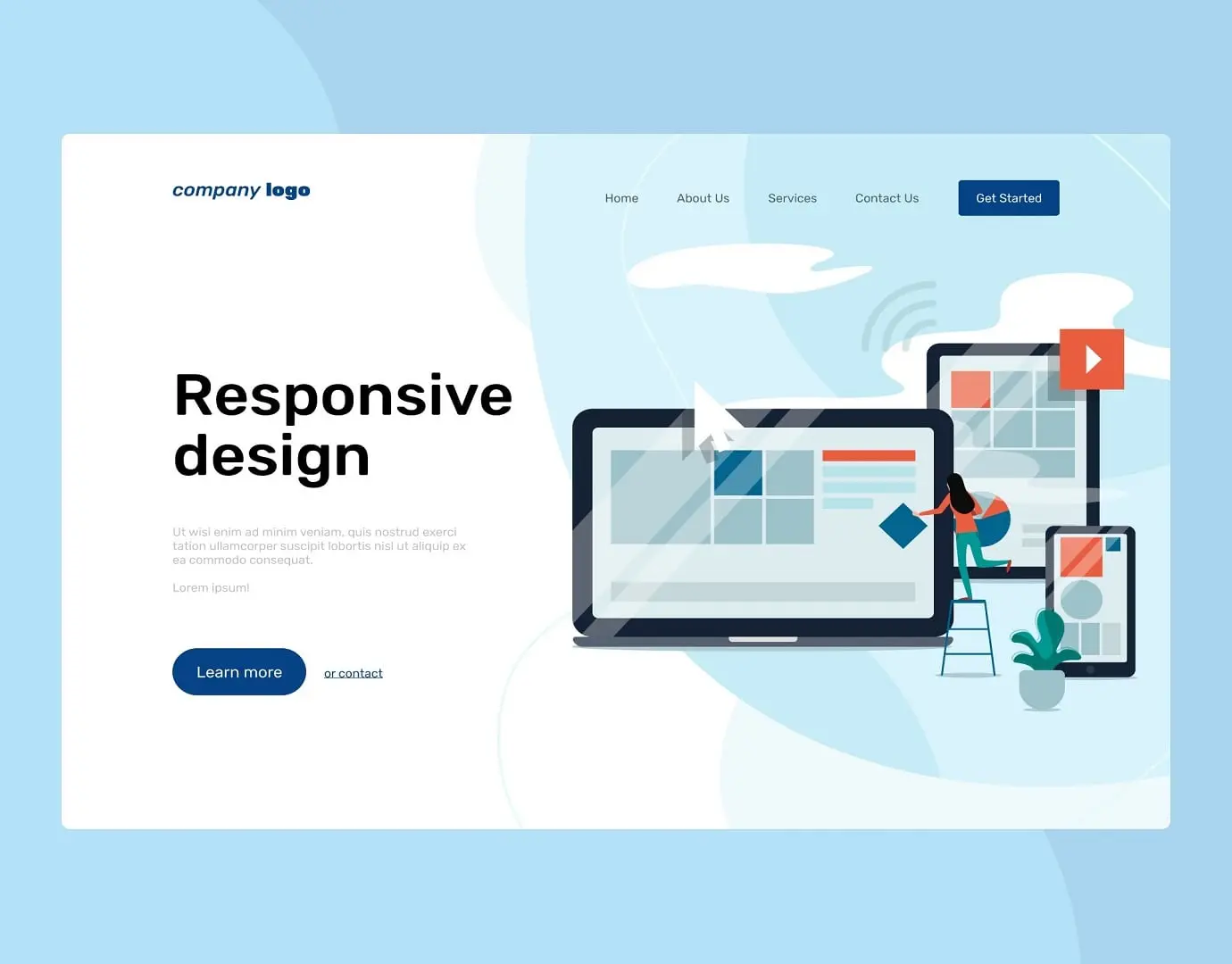
The way people interact with websites has changed dramatically over the last decade. In 2025, users browse across an expanding range of devices — smartphones, tablets, foldables, smart TVs, and even wearable screens. Your website must be prepared to deliver a consistent and optimized experience across all of them.That’s where responsive web design (RWD) comes in.
1. What Is Responsive Web Design?
Responsive web design is a development approach that makes websites automatically adjust to different screen sizes and resolutions. Instead of creating separate versions for mobile and desktop, RWD uses flexible grids, CSS media queries, and fluid layouts to adapt the design dynamically.
At Elevanex Technologies, we apply modern frameworks like Tailwind CSS, Bootstrap 5, and React to ensure websites are not just responsive, but visually consistent and performance-optimized.
2. Why Responsive Design Matters More Than Ever in 2025
Mobile Traffic Is the Majority
Recent studies show that over 75% of global web traffic now comes from mobile devices — and that number continues to rise. Users no longer tolerate websites that don’t display properly on their phones. A single frustrating mobile experience can push them straight to a competitor.
Google’s Mobile-First Indexing
Since Google’s shift to mobile-first indexing, the search engine now prioritizes your mobile version for ranking and indexing. If your site isn’t responsive, you risk losing visibility, ranking, and organic traffic — all of which directly affect your business growth.
Cross-Device Consistency
A responsive site ensures your design, content, and branding look uniform across all devices. This consistency builds brand credibility and helps users recognize and trust your business, regardless of how they access your website.
3. Key Benefits of Responsive Web Design
✅ Better User Experience (UX)
Responsive websites automatically adjust text, images, and navigation for readability. When users can browse easily without zooming or scrolling horizontally, they’re more likely to stay longer and engage with your content.
⚡ Improved Website Performance
Responsive sites tend to load faster, especially when built with optimized CSS and adaptive image scaling. Faster loading not only pleases users but also improves SEO rankings.
💰 Higher Conversion Rates
A seamless user experience reduces friction during critical actions like sign-ups or purchases. This is especially crucial for eCommerce, where even a one-second delay can reduce conversions by up to 7%.
🧩 Easier Maintenance
You don’t need to manage multiple versions of your site. One responsive design means simpler updates, faster deployments, and consistent branding — all from a single codebase.
🔒 Future-Proofing Your Website
New devices are constantly being released — from foldable phones to smart glasses. A responsive design automatically adapts, ensuring your site remains accessible without needing expensive redesigns later.
4. How to Build a Truly Responsive Website in 2025
At Elevanex Technologies, our development approach includes:
• Mobile-first design: Start with small screens, then scale up.
• Fluid grids and flexible media: Use percentage-based layouts instead of fixed widths.
• Adaptive images: Automatically resize images based on device and resolution.
• Performance optimization: Minify assets, use CDNs, and optimize rendering.
• Accessibility testing: Ensure responsiveness also supports inclusive design for all users.
This ensures that your website performs seamlessly — not just visually, but functionally.
5. Real-World Impact of Responsive Design
• eCommerce: Businesses with responsive stores report a 35% boost in mobile conversions.
• Corporate Sites: Improved time-on-site and reduced bounce rates lead to higher engagement.
• Startups: Faster MVP launches since a single responsive site serves all audiences.
6. The Cost of Ignoring Responsiveness
Websites that fail to be responsive risk:
• Poor SEO rankings due to bad mobile performance.
• Higher bounce rates and reduced session times.
• Frustrated users who abandon the site quickly.
• A weakened brand image that appears outdated and untrustworthy.
Conclusion
In 2025, responsive design isn’t an option — it’s an essential part of digital success. A responsive website ensures accessibility, faster performance, stronger branding, and a better user experience.
At Elevanex Technologies, we specialize in building future-proof, responsive websites tailored for performance, scalability, and stunning design. Whether you’re revamping your old site or building a new one, our experts ensure your brand shines across every device and platform.
Share this post:
Related Posts

Web Development How to Use Microservices for Scalable Web Applications
Learn how to use microservices architecture to build scalable web applications. Discover benefits, i...

Web Development The Importance of Mobile Optimization for E-Commerce Websites
In today’s digital marketplace, mobile devices have become the primary way people browse and shop on...

Web Development How to Conduct a Website Design Audit for Better Performance
Learn how to conduct a website design audit to improve performance, user experience, and conversions...